Whispered Luxury in Neutrals: Palettes That Breathe Quiet Opulence

Today we explore neutral color palettes that signal subtle opulence, focusing on how gentle tones, refined materials, and nuanced contrasts create rooms that feel calm, generous, and undeniably elevated. Expect practical strategies, designer tricks, and real stories that show how understated choices outperform flashy statements, make daily life feel serene, and allow craftsmanship, texture, and light to take center stage without ever shouting for attention.

The Psychology of Quiet, Expensive-Looking Neutrals

Calm neutrals guide the eye to form and craftsmanship, encouraging slower looking and deeper appreciation. They reduce cognitive noise, make spaces feel more spacious, and frame textures beautifully. Research on visual comfort suggests lower chroma and balanced contrast promote restfulness, while subtle warmth communicates welcome. The result is a soft-spoken confidence: an elegant mood that suggests investment in quality, restraint, and care—an atmosphere where people feel composed, purposeful, and quietly indulged.

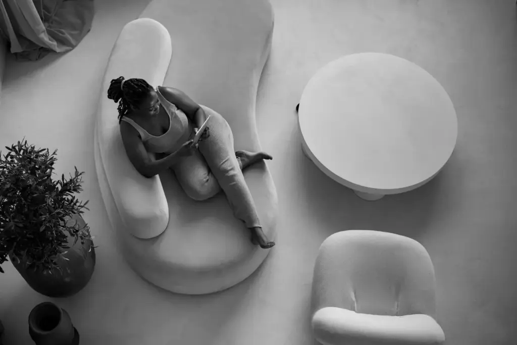
Calm, Control, and Confidence

Soft taupes, bone whites, and mushroom grays create a sense of agency because they do not demand attention, they invite it. By lowering visual chatter, these shades let you control the narrative of a room. Guests read the space as curated, considered, and harmonious. That feeling translates into perceived value: quiet confidence looks expensive precisely because it never appears desperate for approval or overwhelmed by trend-chasing color intensity.

Perception of Quality and Craft

Neutrals offset the temptation to overdecorate, pushing design energy toward joinery, stitching, weave density, and edge details. A natural oak cabinet with fine grain, a linen slipcover with perfect seam alignment, or a travertine coffee table with honed edges becomes the star. When surfaces are calm, imperfections stand out and excellence shines, subtly communicating that money and time were invested where they matter most—materials, construction, and the hand of the maker.

Undertones, Contrast, and Light: Engineering a Cohesive Neutral Scheme

A luxurious neutral palette depends on undertone fluency, controlled contrast, and an understanding of light. Sample generously, observe morning and evening shifts, and measure Light Reflectance Value to manage brightness. Pair a dominant neutral with two supporting tones: one slightly warmer, one slightly cooler, to maintain tension without chaos. Calibrate contrast so edges articulate shape while avoiding harsh breaks, letting rooms breathe with clarity, softness, and human comfort.

Mastering Undertones for Harmony

Beige often hides pink, green, or yellow undertones that change drastically under LEDs or northern light. Paint large samples, place them vertically near floors and ceilings, and compare against pure white printer paper to reveal hidden hues. Choose consistent undertones across large surfaces, then introduce one complementary undertone in accents. This controlled interplay keeps the scheme from flattening while preserving a serene, collected feeling that reads refined rather than busy.

Contrast that Whispers, Not Shouts

Luxurious neutrals rarely jump from bright white to charcoal. Instead, they step gracefully through midtones, using five to seven values that transition like a gentle gradient. Try creamy walls, slightly darker trim, and textiles one or two steps deeper. This soft edge gives furniture beautiful silhouettes without aggressive boundaries. Shapes are legible, shadows feel intentional, and the eye glides rather than jolts, creating an impression of tailored quietude throughout the space.

LRV, Sheen, and Light Temperature

Light Reflectance Value helps tune glow: walls around LRV 60–75 reflect brightness without glare, while trims near 40–55 add depth. Pair matte or eggshell on large planes with satin on trim to articulate details. Test bulbs around 2700–3000K for warmth that flatters skin, fabrics, and stone. Shifts in sheen and temperature can make identical colors feel bespoke, reinforcing a gentle radiance that reads gracious and genuinely considered.

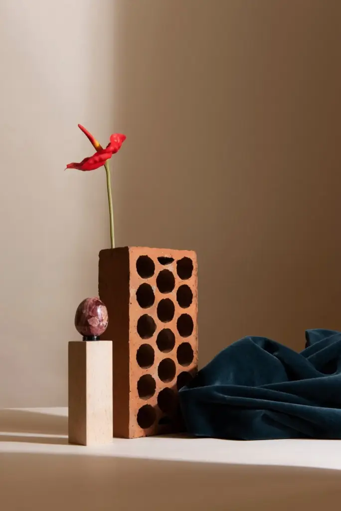
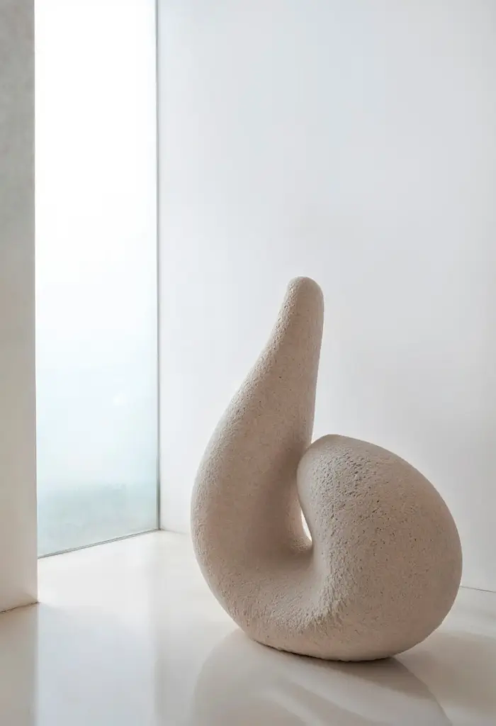
Stone Stories: Travertine, Limestone, and Soapstone

Honed travertine floors in warm beige instantly ground a room, while pale limestone on a fireplace softens geometry with subtle fossils and feathering. Soapstone counters, silky to the touch, anchor kitchens without glitter. Each stone communicates restraint and heritage. Avoid overly glossy sealers; instead, embrace finishes that breathe. The interplay between veining and gentle neutral walls produces harmony that feels expensive because it expresses time, geology, and impeccable material selection.

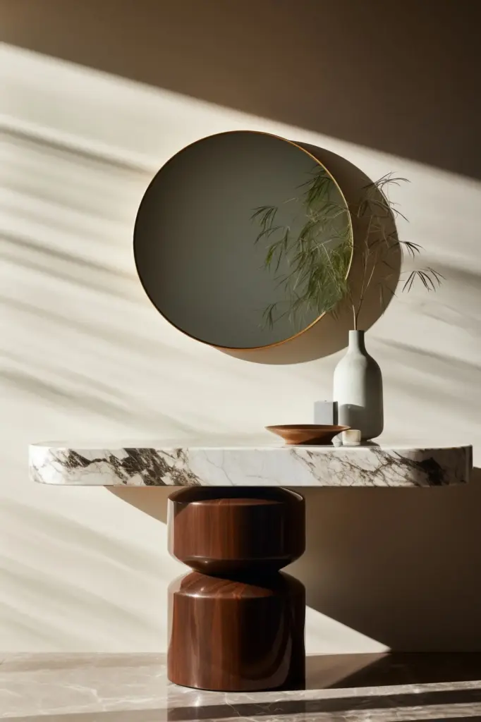
Woods with Restraint and Soul

Quarter-sawn oak shows disciplined medullary rays that read tailored, especially under a natural oil finish that deepens tone without yellowing. Walnut adds chocolate warmth, grounding creams and putties with dignified richness. Choose tight, clean profiles and generous reveals over busy carvings. Even a simple bullnose or beveled edge can carry gravitas when proportions are disciplined. These woods age elegantly, pairing with neutral textiles to create interiors that feel both modern and heirloom.

Metals that Glow Softly

Select unlacquered brass, bronze, or nickel in brushed finishes to avoid mirror glare. Over time, hand oils encourage nuanced patina that complements oatmeal linens and bone-colored plaster. Use metal sparingly: a lamp collar, cabinet hardware, or a single framed mirror. The glint should be a punctuation mark, not a paragraph. When metal supports texture rather than competing with it, the entire palette reads measured, polished, and quietly luminous throughout changing daylight.

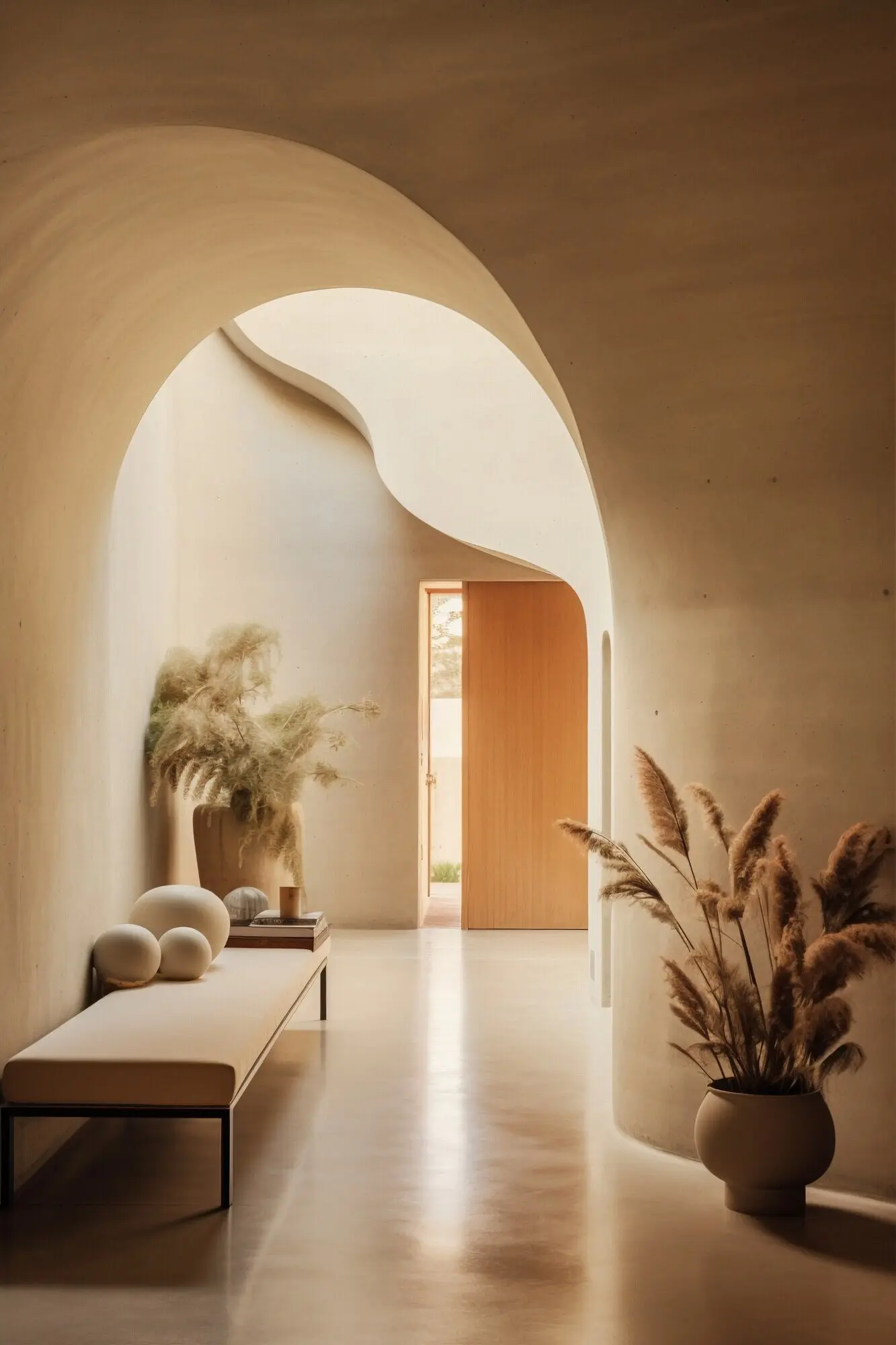
Layering, Texture, and Negative Space

Understated luxury thrives on layers you can feel and gaps that let objects breathe. Combine linen, bouclé, cashmere, sisal, and clay glazes so the hand senses difference. Keep pattern scale modest and rhythmic, not aggressive. Edit generously, leaving negative space as a design element that frames treasured objects. Fewer, better pieces encourage slower looking, deepening emotional connection while communicating confidence, control, and the gracious calm that accompanies deliberate restraint.

A City Apartment Finds Its Breath

A cramped one-bedroom traded stark white and black for warm greige walls, ivory drapery, and a walnut coffee table with a softly radiused edge. Eggshell paint raised perceived ceiling height by bouncing light without glare. Brass pulls, left unlacquered, matured beautifully within weeks. The owner reported better evening focus and calmer mornings. Friends asked if new windows were installed; the answer was undertones, value steps, and thoughtful sheen management.

Cottage Character, Gallery Calm

A stone cottage with heavy beams felt dark despite charm. Limewash in oatmeal beige preserved texture while brightening. Floors were scrubbed and sealed matte, not glossy, honoring age. Artwork moved to tighter groupings with wide mats against mushroom-gray backing, allowing breathing room. Linen sofa covers and clay lamps grounded the look. Visitors remarked on a museum-like calm that still felt warm, crediting patina-forward choices instead of cosmetic, trend-driven updates.

Your Practical Toolkit: Plans, Purchases, and Care

A Seven-Day Palette Sprint

Day one, gather inspiration with clear undertone goals. Day two, purchase sample pots and poster boards. Day three, paint two coats and move boards hourly. Day four, test bulbs and dimming. Day five, decide values for walls, trim, and textiles. Day six, confirm materials and finishes. Day seven, order with confidence. This pace balances momentum and reflection, ensuring your neutral choices feel deliberate, layered, and wonderfully livable.

Shopping with Discipline

List essentials by category: lighting first, foundational textiles second, accent metals third. Bring your swatches to every store and photograph items under varied temperatures. Choose one hero material per room and let others defer. If budget tightens, prioritize fewer, better pieces with honest construction. Document dimensions, edge profiles, and finish codes to avoid costly mismatches. Disciplined buying produces cohesion that reads effortlessly refined rather than pieced together or improvised.

Care, Longevity, and Patina

Maintain matte walls with gentle microfiber and avoid harsh cleaners that raise sheen unevenly. Condition oiled wood quarterly, letting grain deepen with age. Embrace unlacquered metal’s fingerprints; they are the diary of daily life. Rotate cushions and rugs to distribute wear. Minor dings and softened corners become character, not defects. When care rituals are simple and regular, neutrals grow richer over time, rewarding your restraint with soulful, enduring beauty.
Zotetafevakituki
Privacy Overview

This website uses cookies so that we can provide you with the best user experience possible. Cookie information is stored in your browser and performs functions such as recognising you when you return to our website and helping our team to understand which sections of the website you find most interesting and useful.